An interesting statistic shows that Salesforce improves productivity by reducing manual tasks by 10% to 15%. This includes creating Salesforce reports that help project managers analyze data and generate visual reports that showcase key performance metrics.
Salesforce processes around 110 million reports and dashboards in only 24 hours, allowing companies to optimize their sales and marketing strategies, improve customer engagement, and drive revenue growth.
If this doesn’t convince your project management team to use Salesforce reports, what will? In this article, you’ll learn how to customize Salesforce reports and the best practices for ensuring your project management team’s organization.
Getting Started with Standard Salesforce Reports
Table of Contents
Getting started with standard reports in Salesforce is essential for project management. Users must follow a few simple steps to access and run these reports.
First, log in to the Salesforce platform and navigate to the Reports tab. From there, click on the “Standard Reports” dropdown menu, which contains various report categories applicable to project management.
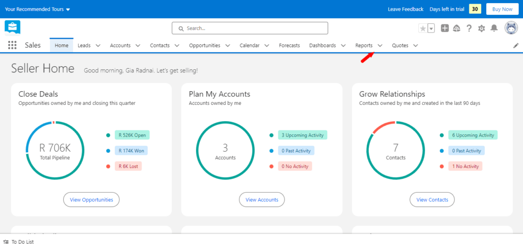
These standard report categories encompass crucial aspects such as accounts, contacts, opportunities, and activities. Users can choose the relevant category based on their specific project requirements. Each category comprises a range of standard reports tailored to track and analyze vital project data.
Standard Report Types in Salesforce cannot be customized. They automatically include standard and custom fields for each object within the report type. After selecting the preferred report category, users can further refine their reports by applying filters. This enables users to focus on specific project metrics and insights. Once the report criteria are defined, clicking the “Run Report” button generates the desired report.
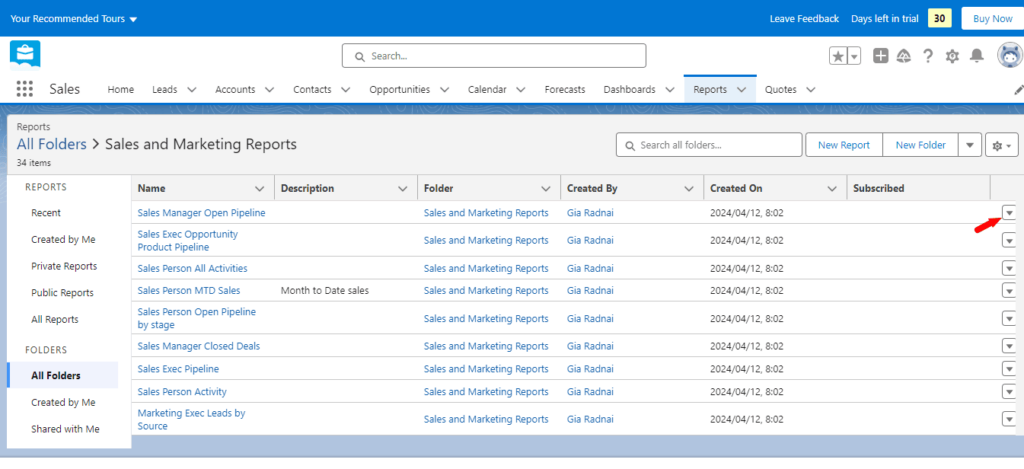
Interpreting standard reports helps to understand the specific metrics and information they display. Salesforce provides user-friendly tools like charts, tables, and graphs to visualize project data effectively. Analyzing these reports can reveal patterns, trends, and key performance indicators, enabling informed decision-making for effective project management.
What are Custom Reports in Salesforce?
With custom Reports in Salesforce, you can personally customize your own reports to meet your exact reporting needs. Unlike the pre-defined ones in the system, such as Standard Reports, Custom Reports can offer a changeable, flexible, and customizable view. This allows one to customize them with fields, filters, and formats relevant to a business process or to a given user’s preference.
Custom Reports can be helpful in scenarios where the standard reports do not meet the business’s specific needs. Here are the following use points:
- To track unique business processes: Organizations have unique processes not covered by default reports.
- Detailed analysis: This is when more in-depth insight is required into certain data points that standard reports may not provide.
- To ensure departmental or campaign and initiative performance, custom reports can help monitor performance.
- Decision Making: They give trends and data that help make strategic decisions.
- Compliance and Auditing: Ensure relevant data concerning compliance with regulations or internal policies is reported.
How to Customize Reports in Salesforce
With custom reports, you can tailor the data, fields, and columns to provide the most relevant information to your business. Creating a custom report is a step-by-step process that starts with selecting the correct report type.
Different Types of Salesforce Reports
Choosing the appropriate report type can ensure that the report captures the necessary data and provides insights that align with your objectives.
Here are 4 different types of reports:
- Summary Reports: A summary report enables you to organize data based on specific criteria. For instance, if you aim to analyze total sales across different regions, you would utilize a summary report that categorizes the data by region and displays the total sales for each region.
Watch this video to learn how to make a summary report.
- Matrix Reports: Matrix reports are very flexible in data analysis and creating Excel pivot tables. They allow the user to insert as many data objects as necessary. The layout of row-column intersections allows for a good view of the complex interactions of data.
Watch this video to learn how to make a matrix report.
- Tabular Reports: Tabular reports give a perspective on the details by including more than one data object. This allows more than one data object to be placed in the report view at a time, helping to view a related record in one report framework and, therefore, to view complete overviews of the required information.
Watch this video to learn how to make a tabular report.
- Joined Reports: Joined Reports epitomize the most advanced form of reporting. It enables a user to merge data from many objects and allows the addition of custom formulas and summaries. This is very helpful to the user while dealing with more sophisticated data analysis tasks, i.e., predictive forecasts.
Watch this video to learn how to make a joined report.
Once the report type is selected, the next step is to customize the fields and columns. This allows you to add or remove data points, providing a comprehensive view of the required information.
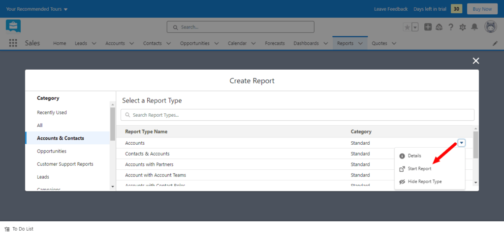
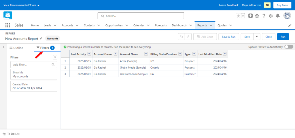
Filters can also be applied to refine the data and focus on specific criteria. Applying filters can narrow down the report results and highlight specific subsets of data, such as specific periods, regions, or product categories.
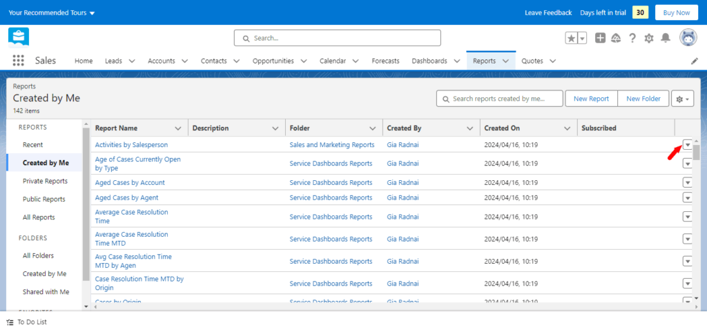
Saving and organizing custom reports is essential for easy access and efficient reporting. Saving custom reports means you can revisit them later and generate updated insights whenever necessary. Logically organizing these reports ensures that they can be easily located and referenced in the future.
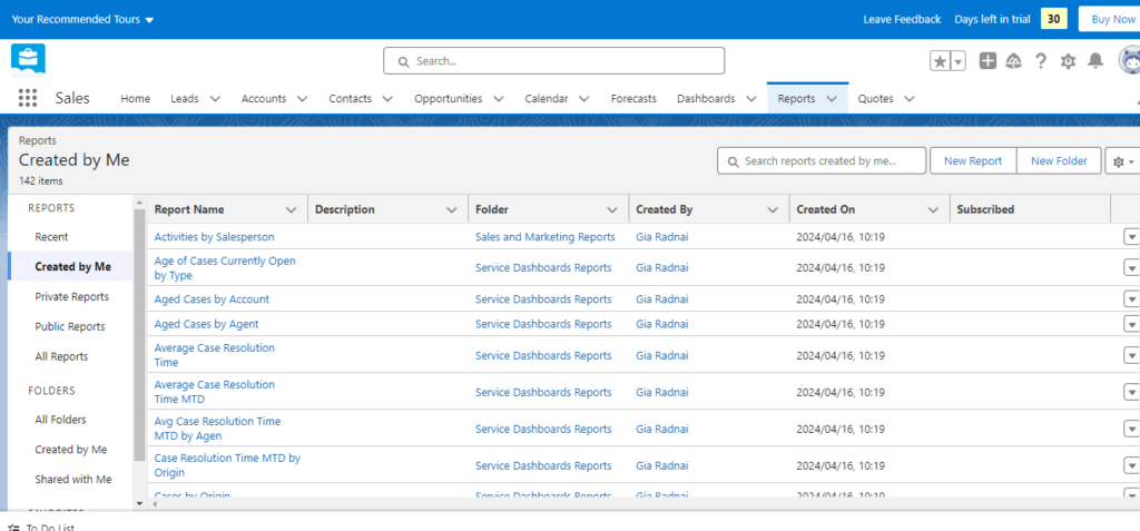
Here is an example where you can search for your reports:
Project Management Reports in Salesforce
While Salesforce doesn’t offer project management reports out-of-the-box, most of the leading project management apps offer this capability. For example, with Inspire Planner you can utilize their pre-built reports and dashboards.
This product offers 6 key custom report types:
- Projects with Project Tasks with Checklist Items: Reports on Projects and their Project Tasks that include Checklist Items and tracking completion status.
- Resource Utilization: Reports on Salesforce Tasks and their assignments to resources within related Inspire Projects.
- Project Time Tracking: Focuses on reporting Projects and Project Tasks along with their time entries.
- Timesheet Reporting: Dedicated to reporting on Timesheets specifically.
- Project Tasks with or without Salesforce Tasks: Allows reporting on all Project Tasks, regardless of their assignment status and related Salesforce Tasks.
- Projects with Risks & Issues: Allows reporting on Projects alongside identified Risks and associated issues.
Inspire Planner comes with pre-built reports that make it easy for you to report on your Projects, Task Assignments, Resource Utilization, and Time Entries:
| Report Name | Report Type Used | Description |
|---|---|---|
| Assigned Tasks by Resource and Status | Resource Utilization | Summary of assigned tasks for all open Projects (where Project Status is not Cancelled or Completed) grouped by Resource and Task Status |
| Overdue Tasks Ordered by Days Overdue | Project Tasks with/without Salesforce Tasks | Contains all overdue tasks prioritized by total number of days overdue. |
| Overdue Tasks by Resource | Resource Utilization | Summary of overdue tasks grouped by resource. |
| Project – Current Status | Projects | Summarizes current status of individual Projects. |
| Project Budget Summary | Projects | Summary of Project budget performance – which Projects are on budget and which ones are over. |
| Project Effort Summary | Projects | Summary of project hours and effort utilization to-date. |
| Project Portfolio Summary | Projects | Summary of all Projects grouped by Project status. |
| Project Schedule Summary | Projects | Report showing which Projects are behind schedule and by how much. |
| Project Slippage Summary | Projects | Summary of which Projects are taking longer than planned. |
| Projects – Parent Task Summary | Projects with Project Tasks | List of active Projects (where Project Status is not Cancelled or Completed) with a summary of parent tasks. |
| Resource Allocation by Month | Tasks and Events | Summary of Hours (Planned and Actual) per assigned Resource per Month. |
| Resource Allocation by Project | Tasks and Events | Summary of Hours (Planned and Actual) per Resource per Project. |
| Time Tracking by Active Project | Project Time Tracking | Summary of all time entries for Project Tasks, grouped by active Project (where Project Status is not Cancelled or Completed). |
| Time Tracking by Resource This QTR | Project Time Tracking | Summary of all time entries grouped by Resource and by Proejct, for the current quarter. |
| Time Tracking by Resource This MONTH | project Time Tracking | Summary of all time entries grouped by Resource and by Project, for the current Month. |
| Time Tracking by Resource This WEEK | Project Time Tracking | Summary of all time entries grouped by Resource and by Project, for the current week. |
| Unassigned Project Tasks by Project | Project Tasks with/without Salesforce Tasks | Contains all unassigned Project Tasks for open Projects (where Project Status is not Cancelled or Completed), group by Project. |
| Upcoming Projects by Month | Projects | Summary of all Projects, grouped by Month based on Project Start Date. |
Project Status Report
Inspire Planner also offers a Project Status Report out of the box. It is a detailed PDF document that provides a snapshot of the project’s current standing and that can be generated with a click of a button.
This report contains vital project information: the project name, project status, percentage of completion, key tasks, KPIs, and more. Active risks or issues related to this project will also be displayed if you are tracking those. If needed,
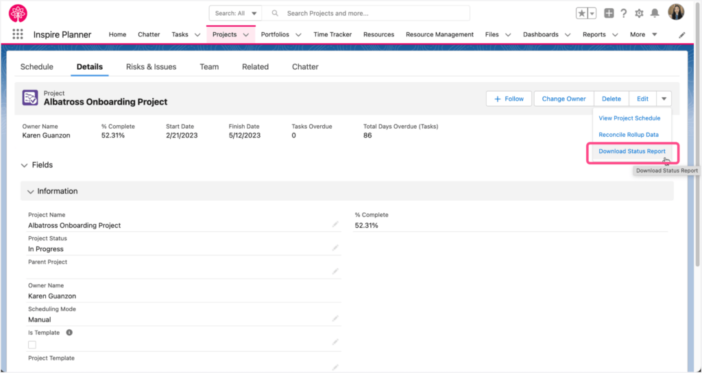
The Project Detail page provides a button “Download Status Report.” When clicked, the report is immediately generated and attached to the project in the Files Related List. Users can also download a copy of the report to review offline or for distribution.
Salesforce Dashboards
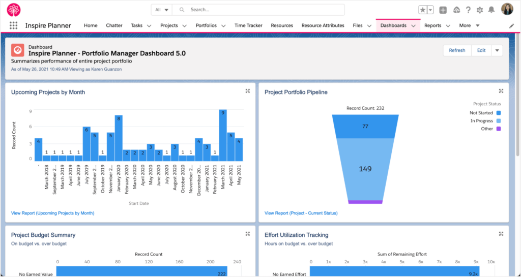
To help you visualize your data from reports, Inspire Planner offers two dynamic dashboards to enhance project management capabilities within Salesforce: the Resource Manager Dashboard and the Portfolio Manager Dashboard. These dashboards, designed as dynamic tools, require separate installations in your Salesforce org but are completely free of charge for Inspire Planner customers.
6 Best Practices for Customizing Salesforce Reports
When customizing reports in Salesforce, there are several key considerations to remember.
1. Define the report’s purpose or objective. Understanding what data needs to be captured and analyzed will help determine the most relevant fields to include in the report.
Scenario: If the goal is to increase regional sales efficiency, your report should focus on sales volume, conversion rates, and average deal size per region. This clarity will guide the essential fields, such as sales region, total sales, and number of deals closed.
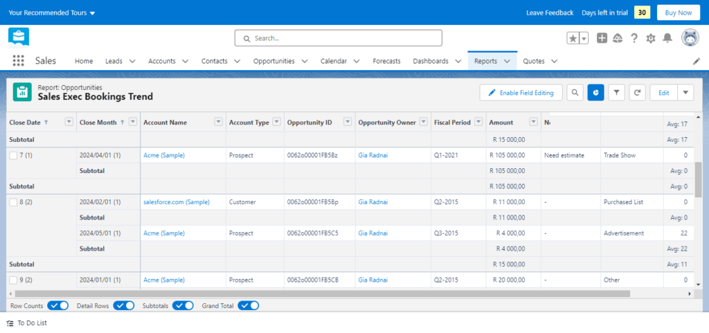
2. Considering the report’s target audience is crucial for effective customization. Different users may require different levels of detail or specific metrics. For a sales manager, the report might need to provide detailed performance metrics per sales rep to help manage the team effectively. In contrast, an executive might prefer a high-level overview showing the performance of different regions.
3. Maintain simplicity and organization in your reports and dashboards. Employ straightforward, brief labels, and minimize clutter. For a monthly performance dashboard, use clear labels such as “Total Sales in April,” “Average Deal Size,” and “Top Performing Regions.” Group related metrics together, like having all sales performance indicators in one dashboard section to facilitate quick analysis.
4. Leverage the power of filters and custom fields to enhance the utility of your data. Use these tools to filter data by specific categories or periods or to create custom-calculated fields that provide unique insights. If analyzing quarterly performance, set filters to only include data from the current quarter. Create a custom field that calculates the percentage change in sales compared to the previous quarter to provide immediate insights into growth trends.
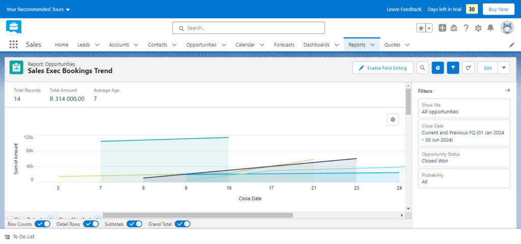
5. Charts and graphs are valuable visual tools that help understandably convey complex data. Utilize these to demonstrate trends and compare and highlight important data points. Use a line chart to show sales trends over several months to highlight growth or dips. A bar chart comparing the current quarter sales with the previous quarter across different product categories can quickly draw attention to which categories are performing well.
6. Share the reports and dashboards with the appropriate users to maximize effectiveness. Manage access through Salesforce’s sharing settings and consider customizing different versions for various users or teams. Ensure that only relevant team members have access to specific reports. For instance, a detailed operational report might be restricted to mid-level management, whereas strategic overview reports are shared with senior leadership. Customize dashboards for different departments to reflect metrics pertinent to each team’s function.
Key Limits of Salesforce Reports
Salesforce has some report limits you should be aware of. This guide explains these limits in more detail.
- Row and Grouping Display: Standard Salesforce reports can display up to 2,000 rows or groupings. It is easy to export the report or change the settings for display to all groupings or rows.
- Fields and Formulas: A report can include up to 1,333 characters in filter criteria and support up to 21-digit summary fields. Summary fields are calculated at most five in a report.
- Filtering and Searching: Each report can handle a combination of up to 20 field filters with further complexity constraints, such as limiting long text area fields to only the first 1,000 characters.
Visualizing Data for Better Insights
Visualizing data effectively is crucial for project managers in Salesforce to convey complex information simply and clearly. The right visualizations can highlight trends, expose issues, and drive better decision-making.
Different types of charts serve different purposes:
- Bar charts are excellent for comparing quantities across different categories.
- Line charts help track changes over time, making them ideal for project timelines and progress tracking.
- Pie charts can show percentage or proportional data, such as the distribution of work among team members.
- Gantt charts are specifically beneficial in project management for visualizing project schedules. They show both the duration of activities and their sequence. Read the following guide to learn more about using Gantt charts in Salesforce.
Subscribing to Reports in Salesforce
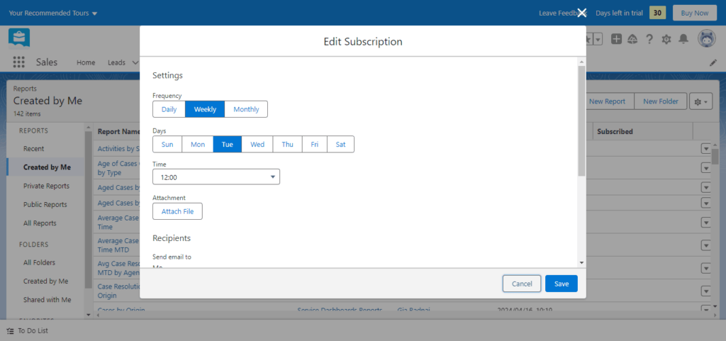
Here are 2 steps on how to subscribe to a report:
1. Navigate to the Report: Open the report you wish to subscribe to in Salesforce. Make sure the report is saved with all the necessary filters and formats.
2. Subscribe to the Report: Look for the ‘Subscribe’ button at the top. Click on this button to start setting up a subscription. If the ‘Subscribe’ button is not visible, you may need to check your Salesforce permissions or consult your Salesforce administrator, as subscriptions might be restricted.
Set Subscription Conditions
Here are 5 ways to set your subscription’s conditions:
- Frequency: Decide how often you want to receive the report (e.g., daily, weekly, monthly).
- Conditions for Sending: You can set conditions for sending the report. For example, you might only want the report emailed if specific metrics exceed or fall below predefined thresholds.
- Time of Day: Choose when you want the report to be sent. This can be critical for ensuring the report is timely, for instance, before a recurring meeting or first thing in the morning.
- Choose Recipients: You can add recipients who need to receive the report. This might include team members, department heads, or external stakeholders.
- Save and Activate Once all settings are configured to your preference, save the subscription. The report will be sent automatically according to your specified schedule and conditions.
How to Send Salesforce Reports Automatically
For scenarios where you need to send a report automatically without requiring individuals to subscribe, you can do the following:
- Automated Report Distribution Setup: From the report view in Salesforce, instead of subscribing, you would use the functionality to schedule the report. The report options typically find this under ‘Schedule Future Runs.’
- Define the Schedule Details: Like with subscriptions, define how frequently the report should be sent (daily, weekly, etc.), and specify the start and end dates for the scheduled sends.
- Select Time Zone and Time: Choose the appropriate time zone and the specific time of day you want the report sent.
- Set Recipients: Enter the email addresses of all individuals needing the report. Salesforce allows you to send these reports to users within your organization and external emails, depending on your system’s settings.
- Additional Options: Depending on your Salesforce configuration, you might have additional options such as attaching the report as a CSV file, including a custom message with the report, or even specifying advanced conditions for sending the report based on data changes or thresholds.
- Save and Confirm: Save your settings and confirm the schedule. Salesforce will handle the rest, sending out the reports at the specified times.
Sharing and Collaborating with Reports
Efficient collaboration and sharing of reports are essential in managing projects effectively in Salesforce.
Managing Permissions for Accessing Sensitive Project Data
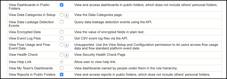
The data displayed in reports is based on the running user’s sharing and security settings. However, when we schedule a report, we must select a running user based on the security and sharing settings in which the report is generated.
Every report is saved in a particular folder. Users who have access to the report folders can run the report.
Types of Access Level of Folders
With the help of these access settings, you can decide who gets to see the reports in Salesforce in which access level. There are three types of access levels of folders:
- Viewer: With this access level, users can see the data in a report but cannot make any changes except cloning it into a new report.
- Editor: With this access level, users can view and modify the reports it contains. In Edit access, we can’t add the user.
- Manager: With this access level, users can do everything Viewers and Editors can do and control other users’ access levels to this folder. They can also rename or delete the report.
5 Advanced Salesforce Reporting Features
Project managers should utilize these 5 advanced Salesforce reporting features to get the best out of their Salesforce reports.
- Cross Filters are a great feature of Salesforce, allowing you to include or exclude related records from a report. This is useful in building exception reports, such as accounts without contacts, opportunities without recent activities, etc. Further, these reports can be fine-tuned with more filters to drill down the details and help them understand a better view of business operations.
- Formula Summary: This allows complex calculations to run in reports from different summary levels across the summaries. Users will be able to create custom formula fields directly within the report, thus performing dynamic analysis on grouped data. An example is the calculation of the percentage contribution of each Account to a specified type of Opportunity—an aid to assessing account performance in real-time within the reporting environment.
- Row-level Formulas: Row-level Formulas, as opposed to Summary Formulas that apply to the entire summarized report, apply to individual records. The formulas could evaluate conditions or perform calculations for each record in the report; they are a flexible tool for detailed record-level data analysis. This is useful for on-the-fly, customized data checks or unique calculations for each record.
- Reporting Snapshots: Reporting Snapshots capture data state on a scheduled interval so that users can trace and analyze historical data trends over time. This ability is important for tracking changes in the Opportunity pipeline or assessing business process impact over several periods, among other kinds of long-term data analysis.
- Historical trend reporting: The snapshot provides an extension of the capabilities that focus on trends and historical data of specific fields in Salesforce objects. This would allow the user to track how specific data points have changed over a given “As of” date, allowing the data engineer to see changes more granularly. This is especially useful in tracking essential business metrics and measuring interventions’ impact in the different areas of the business.
Final Thoughts
Tailoring reports to specific project requirements can help businesses gain valuable insights that enable better decision-making and resource allocation. The ability to filter, group, and summarize data through Salesforce’s reporting capabilities allows companies to track progress, identify bottlenecks, and make timely adjustments to ensure project success.
Furthermore, we encourage professionals to take advantage of Salesforce’s reporting features. Experimenting and exploring different report customization options can lead to discovering new ways to analyze and visualize project data, further enhancing project management practices.
To maximize Salesforce’s reporting capabilities, we invite you to install a free trial of Inspire Planner or request a personal demo. Inspire Planner is a powerful project management application specifically designed for Salesforce, offering seamless integration and advanced reporting capabilities.

