Salesforce today is the #1 CRM choice for the majority of enterprises irrespective of the size. Companies across the globe have been using multiple Salesforce modules to optimize Customer and employee experience. Be it Sales, Service, Quoting, Project management, or Customer support, there is one Salesforce aspect common to each of these process areas. It is the ability to get a microscopic as well as a macroscopic view into the process operations with Salesforce Dashboards.
Reporting in Salesforce
Salesforce provides access to generate Reports and Dashboards features in every instance. Before we start with understanding Salesforce Dashboards in detail, we need to start with a basic understanding of below three features:
Salesforce Reports
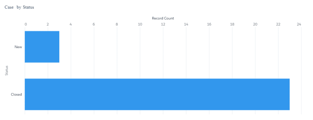
A report in Salesforce is a collection of rows and columns to represent data following defined filters, groupings, and sorting. Report results can be presented in graphical and tabular formats. Below is a screenshot of a Salesforce report created to showcase cases generated in a queue, categorized by case status.
Salesforce Dashboards
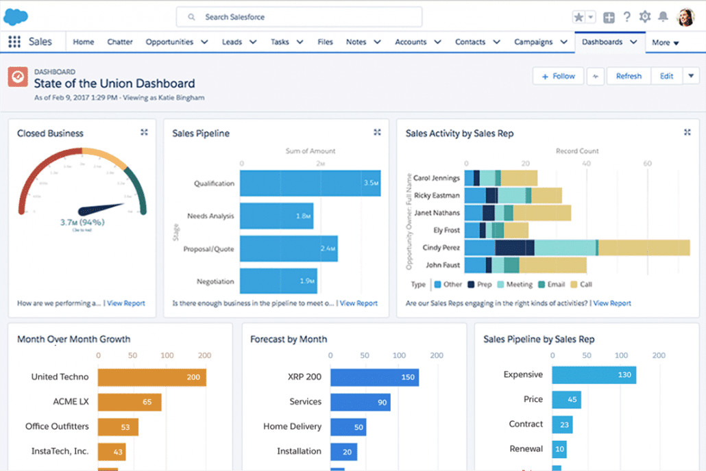
Salesforce Dashboards enable users with a canvas where they can design and add multiple reports and components to present a consolidated view of analysis. Salesforce provides a drag-and-drop dashboard designer experience for designing Dashboards for analysis purposes. Below is a sample dashboard presenting the business attained and pipeline status for a group.
Folders
Salesforce provides Reports and Dashboard folders to allow users to organize and share reports and dashboards within a Salesforce org.
Creating & Customizing Salesforce Dashboards
Using Salesforce Dashboards, you can add multiple reports to create a consolidated presentation of reporting metrics that aid decision-making based on real-time data. Salesforce Dashboards are used to identify trends, sort results, measure impact, and much more.
Here’s a step-by-step guide for creating dashboards in Salesforce Lightning.
Step 1
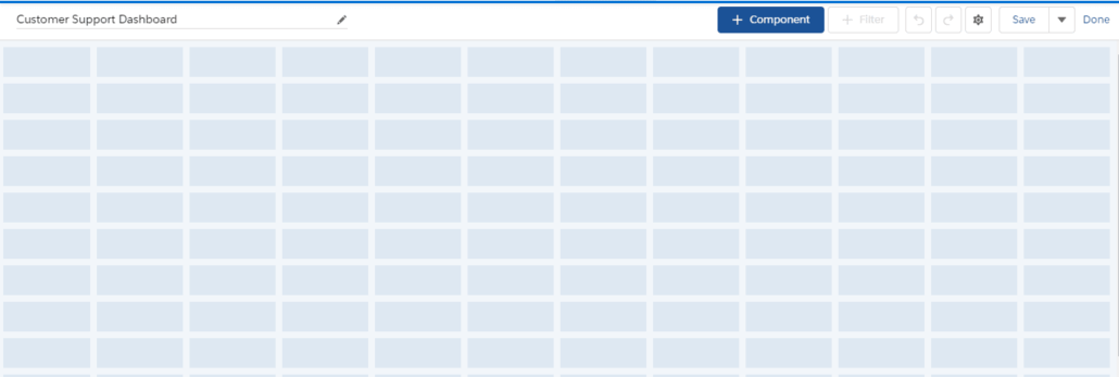
While the system allows users to create Salesforce Dashboards without reports, it’s always a good practice to have at least the first report you want to add to the dashboard ready, before you start designing a dashboard. Search for the dashboard object on “App Launcher” and select the “Dashboard” tab. Once on the dashboard object, click “New Dashboard”.

Step 2
Provide a Salesforce Dashboard name, description and select a relevant folder. You will be directed to “Lightning Dashboard Builder”. We will start with understanding what a Salesforce dashboard is built of:
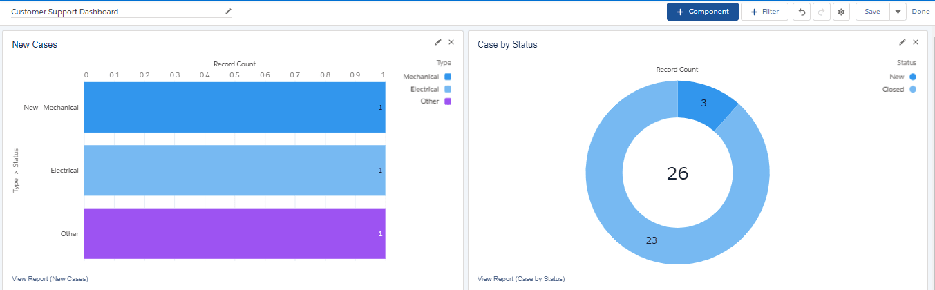
- Component: Components are the visual blocks on top of which a Salesforce Dashboard is designed. Every information point on the dashboard is added as a component. Components can be a chart, gauge, metric, or table.

- Source reports: Each component on the dashboard is sourced by a report in Salesforce. Users can create reports using Report Builder in Salesforce for different parameters they want to measure and present on the dashboard. Users can then add one or more source reports on Salesforce Dashboard components
- Filters: Filters allow dashboard’s viewers to get filtered report results based on defined criteria and see specific results
Step 3
Select “+ Component” to select the report you want to view on the Salesforce Dashboard. Once the report has been selected, users can select the chart to be applied to the dashboard component. Users can further define component parameters like:
- X-axis and Y-axis range,
- whether to show values or not,
- decimal places for values,
- sort by,
- number of rows to display,
- title,
- subtitle,
- positioning,
- legends and
- color palettes
Step 4
When you finish adding the components, select “Save” to save them temporarily.
Step 5
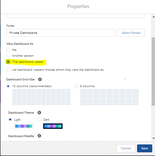
Once all components have been added to the dashboard, users can further set Salesforce Dashboard properties to define the dashboard’s layout and experience using the settings icon on the top right. Below are the different Salesforce Dashboard properties that can be defined by the user:
- Name
- Description
- Folder: Users can define the folder where the dashboard will be stored. By default, the dashboards are saved in the user’s private dashboard folder.
- View Dashboard As: Users can also select how they want the components to be displayed once activated
- Dashboard Grid size: Users can define the number of columns they want to be added to the dashboard
- Dashboard Theme and Palette: Users can define dashboard theme (Light or Dark) and choose from the list of color palettes to suit company branding and visibility needs
Step 6
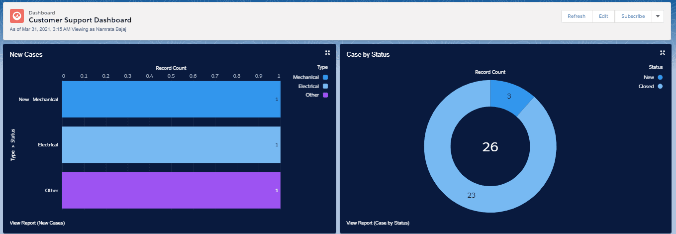
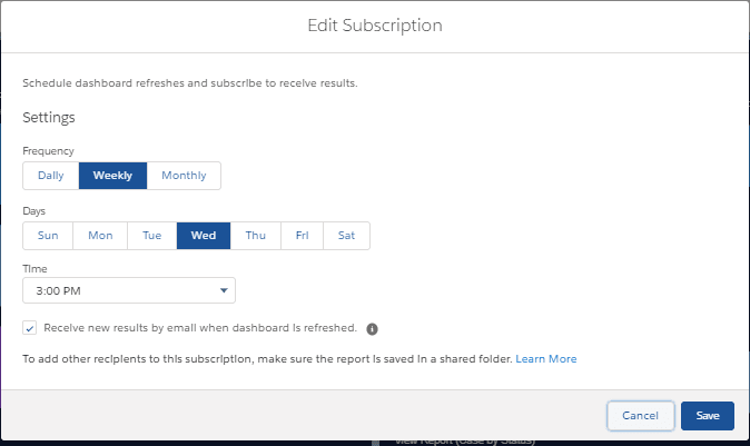
Once the dashboard has been created, select “Done”. Users can click “Refresh” to view updated dashboard results. Users can also subscribe to the Salesforce Dashboards to get emails on regular dashboard results and share the dashboard communication with other users.
Dynamic Dashboards in Salesforce
The viewing settings for Salesforce Dashboards may vary depending on their purpose. For example, a Dashboard created to present monthly team performance would always show the same results irrespective of the viewers. However, a dashboard created to show the daily workload for an agent would show results specific to the viewer. Salesforce provides the ability to make “Dynamic dashboards” that show tailored results specific to the user. All a user has to do is select the “View Dashboard As” setting as “The dashboard viewer” to create a dynamic dashboard.
Salesforce Dashboards on AppExchange
There are a lot of free and paid apps available on Salesforce AppExchange with predefined dashboards designed specifically for enterprise process areas like sales, service, work management, and many more. Below are some examples of AppExchange apps with predefined dashboards.
- Salesforce CRM Dashboards: https://appexchange.salesforce.com/appxListingDetail?listingId=a0N30000004g316EAA
- AppExchange Dashboard Pack for Sales, Marketing and Service: https://appexchange.salesforce.com/appxListingDetail?listingId=a0N300000016ZsfEAE
- Sales Activity Dashboard: https://appexchange.salesforce.com/appxListingDetail?listingId=a0N300000016aZzEAI
- Service & Support Dashboards: https://appexchange.salesforce.com/appxListingDetail?listingId=a0N300000016Z6kEAE
Tips to Create Effective Salesforce Dashboards
Although Salesforce provides out-of-the-box capabilities to create dashboards and sample templates to create your Salesforce dashboards, it is always critical to choose the correct template and the design for your dashboard to represent the business case and focus on important factors from that dashboard. Below you can find a few tips for consideration that might help you make your dashboards more effective.
Choose the correct component type
Dashboards have a visual appeal that engagingly conveys the information to end-users. Apart from the data that forms the baseline for this dashboard, design plays an important role too. One of the most important factors contributing to the design and look and feel of a dashboard is the component type. You may be able to find a lot of content on what type of component you should choose to represent what kind of data, but apart from data you should always keep in mind the visual appeal before finalizing a component for a dashboard.
Do not clutter your Salesforce Dashboards
Salesforce Dashboards are meant to represent a large amount of information and several data points on a single screen. However, you should also keep in mind the aesthetics of the dashboard. Too much information on one dashboard is sometimes not visually appealing and so you should always limit the number of components and data being represented on the dashboard.
Teach your users how to build Dashboards
You can give your users a fish (e.g. a ready Dashboard) or you can teach your users how to fish. Ask your Salesforce admins to build visual step-by-step guides to explain how to build Dashboards. One of our favorite tools to generate step-by-step guides is Scribe. You simply need to record your process and Scribe will automatically turn it into a guide that you can further customize and share or embed it into existing tools.
An Alternative to Salesforce Dashboards
While Salesforce Dashboards offer you a great way to review your data, some more advanced analysts might run into report limitations and seek alternatives.
For such users, Coefficient could be a great alternative. It is a no-code solution that allows data users to automatically sync Google Sheets with their business systems like Salesforce to have live data. And for Salesforce users, they offer several Salesforce templates and reports for Google Sheets.